

Boettger Zucker — Cultural Repositioning & 360° Campaign Concept
Transforming sugar from a commodity
into a cultural luxury brand
Project Summary
Instead of competing within a market increasingly critical of sugar consumption, this project repositions sugar entirely — shifting it from a consumable product to a cultural artifact.
By embedding Boettger Zucker into the context of art, architecture, and design, the brand becomes part of a curated cultural experience rather than a product on a shelf.
Boettger Zucker approached me with complete creative freedom to redefine how their brand is perceived within a market that often views sugar negatively. The challenge was to reposition sugar as an object of design — elegant, valuable, and culturally relevant.
My concept treated Boettger Zucker not as a food product, but as a lifestyle brand embedded in the world of art, architecture, and design. Through a minimalistic visual identity and a curated campaign strategy, the brand was imagined as a presence within galleries, museums, theaters, and philharmonic halls — a statement of refined aesthetics rather than consumption.
Client
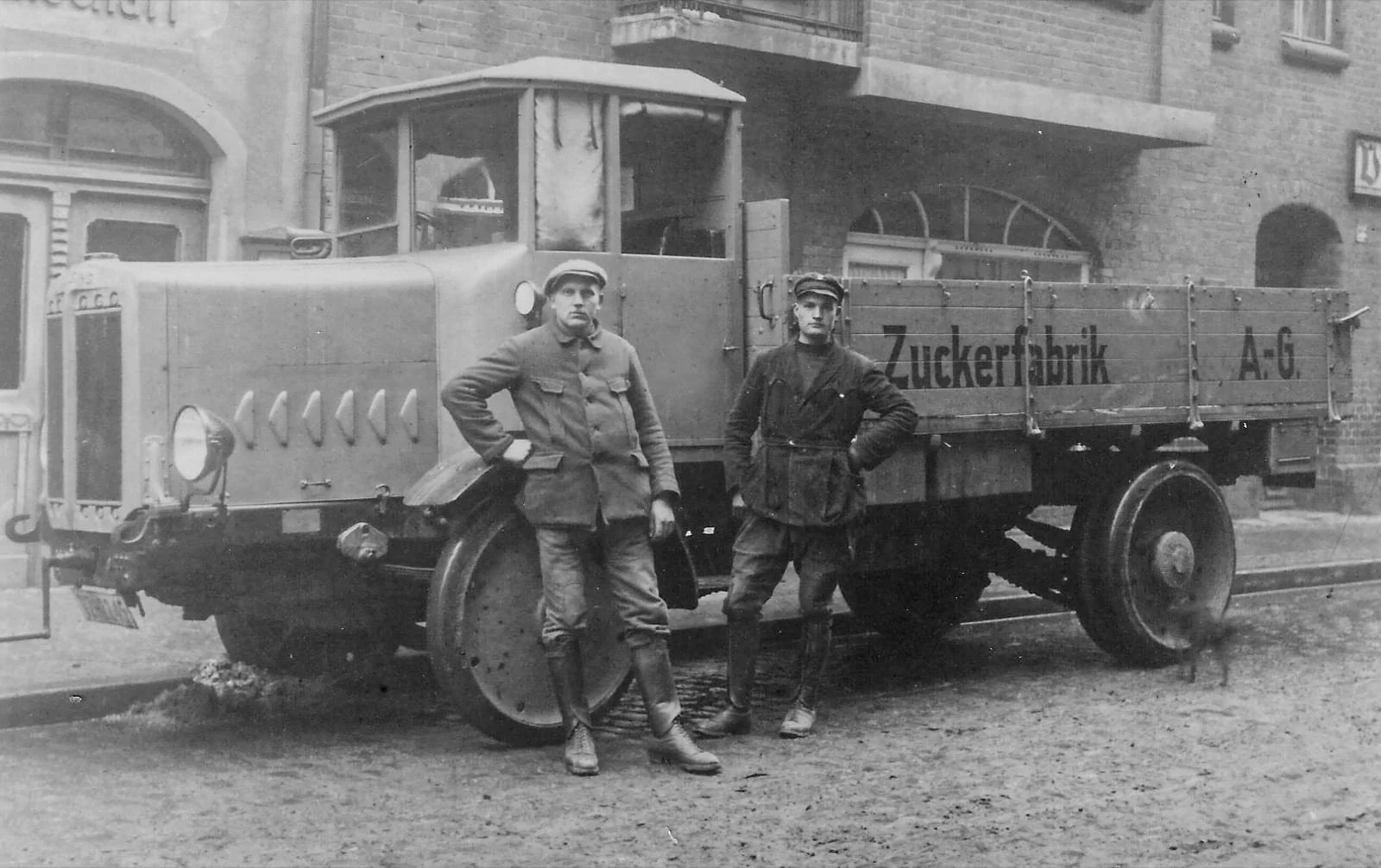
Boettger Zucker is part of the Boettger Gruppe, a German company with over 150 years of expertise in sugar production and trade, operating in both industrial and consumer markets. The company sought a contemporary rebranding to resonate with design-conscious and culturally engaged audiences.
Campaign & Brand Experience
The campaign extends into carefully selected cultural touchpoints, including museums, design stores, theaters, and philharmonic halls.
Rather than relying on traditional advertising, the brand integrates itself into environments associated with aesthetics and intellectual engagement. This creates a subtle yet powerful shift in perception — positioning sugar within a context of culture, design, and refinement.
Additionally, the concept introduces a “Designer’s Edition” — a series of limited-edition collaborations with international designers, alongside open calls and competitions for packaging and flagship store concepts. This approach not only generates visibility but actively invites the creative community to shape the brand’s evolution.

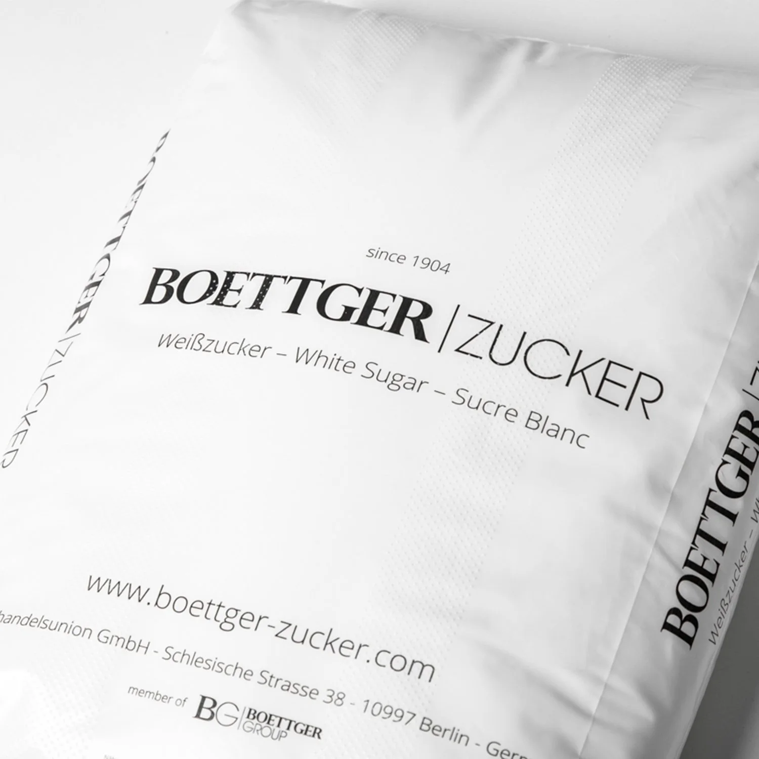
Logo Redesign
The original logo carried a sense of tradition and heritage but lacked the precision and reduction needed to appeal to a modern, design-oriented audience.
The new identity translates the brand into a compact, modular typographic system. A reduced 3×3 lettermark creates a strong visual anchor, complemented by a refined logotype derived from the original typeface. This balance preserves legacy while introducing clarity, structure, and contemporary relevance.


Packaging as an Object
The packaging plays a central role in redefining the product as a design artifact.
Instead of conventional formats, the packaging is conceived as a modular system of geometric forms inspired by Bauhaus principles. Each unit is designed to function both independently and as part of a larger composition, allowing the products to be stacked, arranged, and displayed like architectural objects.
Materiality, proportion, and tactility are treated with the same care as in product or exhibition design. The result is packaging that moves beyond function — becoming a sculptural element that invites interaction and reinforces the brand’s presence within curated cultural spaces.


My Role & Contribution
Developed the overarching creative concept and strategic repositioning
Designed a modular logo system and defined the visual identity
Created a cohesive design language rooted in minimalism and Bauhaus principles
Designed a high-end, modular packaging system
Conceptualized campaign touchpoints and brand experiences across cultural spaces
Proposed future-facing formats such as collaborative editions and design competitions
What I learned
This project deepened my understanding of how perception can be shifted through context rather than product change.
It strengthened my ability to connect strategy, concept, and visual execution into a cohesive system — and reinforced the importance of thinking beyond traditional advertising by designing experiences that operate within cultural and spatial environments.