

Boettger Zucker
Corporate design, strategy, packaging
Task and Goal
Boettger Zucker was looking for a new way to present themselves within the negative perception of sugar. Experimenting with the possibility of a new product, they decided to approach me with complete creative freedom. The goal was to create a design, look and campaign that would shift the general thoughts of sugar into a more elegant and luxurious segment.
In order to reach this goal, I wanted to think outside the box and portray the company as a brand that does not only identify with “luxury” but with a design and unique advertising proposition approach that would stand out and grab the attention of the intellectual art and design interested.
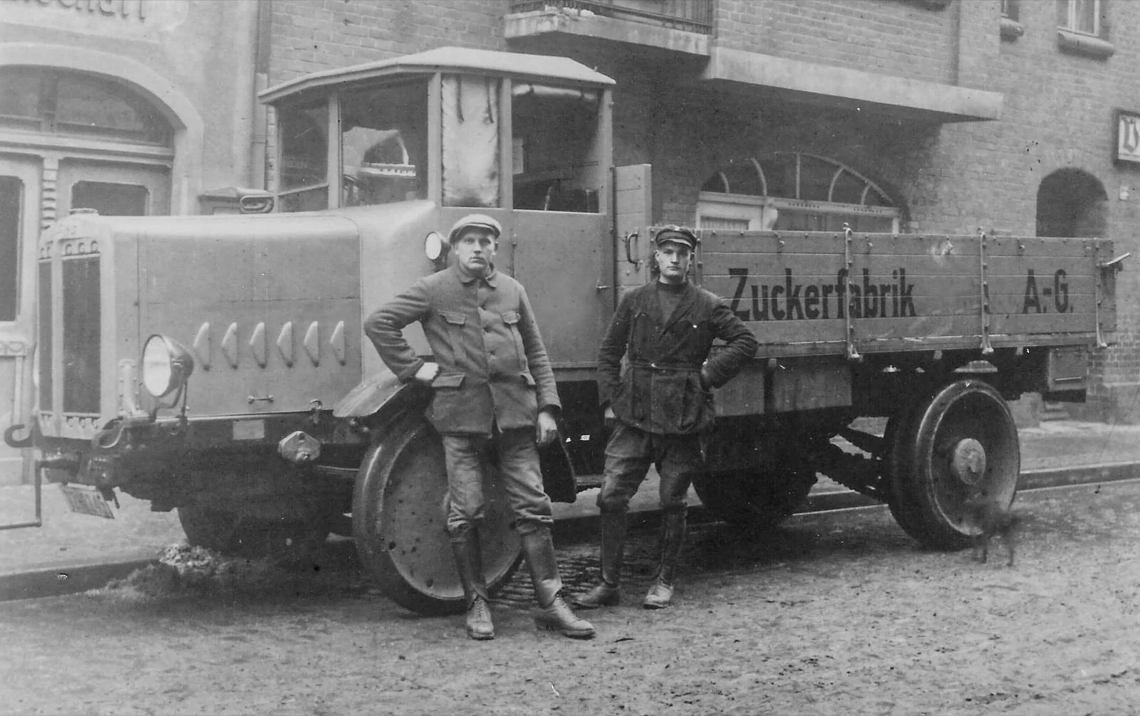
Find out more about the company’s history

Redesigning the Logo
The old logo was classic and elegant, yet its big-size and packaging did not align with my goal to speak out to new art and design interested customers.

Original logo and package design
In order to achieve that, I have created a modern version of the company name by turning it into an elision. Decreasing its size to a 3x3 letter typographic logo, adding the full name in a variant of its former used fonts.


Concept strategy
Sugar is what it is, and although Boettger Zucker has the potential to offer an exquisite variation of products, the first main strategy will be its presentation and customer touchpoints. By that I have created a unique advertising proposition that incorporates an outstanding packaging design, as well as an exclusive representation and availability at museums, art galleries, architectural spaces, theaters and philharmonic concert halls, as well as art and design events.
The focus should not emphasis the product, but its connection to culture.

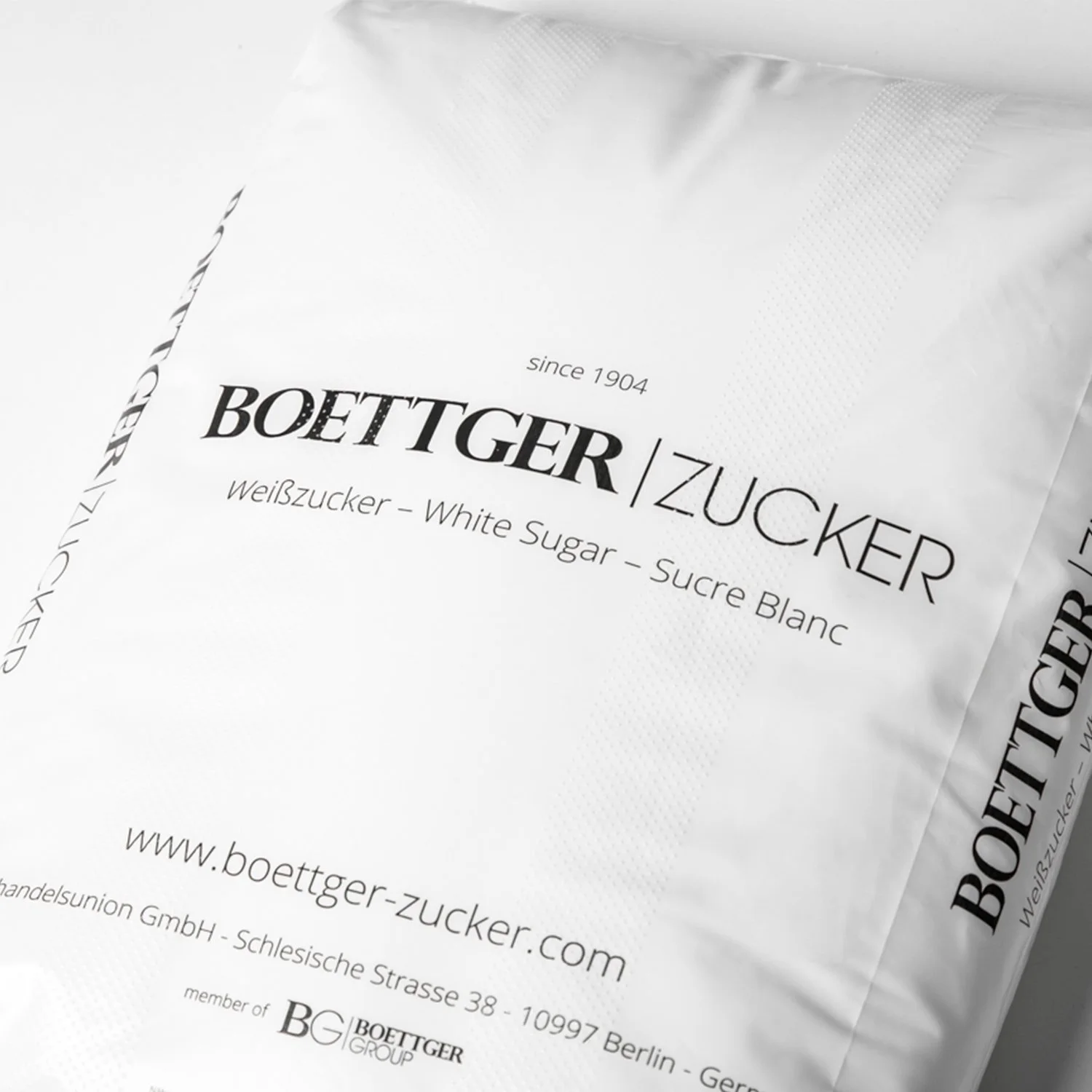
Packaging design
Every household has sugar and every restaurant and café will offer sugar to their customers. In order to stand out, a unique, well thought packaging design will be key to outshine all other products of the market and be memorable to the eye. For that I have created a packaging line for usual, crystal and liquid sugar, as seen in the pictures.

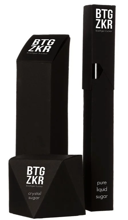
Each package is created with a water-resistant matte black paper, giving a light textured feel. The product should be so pleasant to look at, that it can stand as a decorative element for itself.

Continuing collection
While the main packaging will keep its founding design, the future will be open for new collections,
offering limited new packaging designs, created in cooperation with renown designers around the world.


Thank you for your attention
This project was created alone as part of my third semester university project in cooperation with Boettger Zucker. This display is only a small section of my work, which included market analysis, all stationary corporate designs, manual, presentation and many hours of concepting and handcrafting the packaging designs.